WhatБ─≥s in this topic
This topic is aimed for developers, who need to reuse the Magento UI Components.
The topic covers the following:
- UI componentsБ─≥ configuration
- The most important UI componentБ─≥s properties
- UI componentsБ─≥ properties used for linking
- Description of the additional UI components
- JS UI components debugging
UI componentsБ─≥ configuration
A UI componentБ─≥s behavior, configuration and structure is defined by the following:
-
The available configuration options and methods for components of a certain type, defined in the componentБ─≥s .js file.
-
The actual configuration and structure of a particular component, specified in the componentБ─≥s configuration
.xmlfile, in the scope of the<argument></argument>node. The configuration file also extends properties, specifies the componentБ─≥stemplate and the path to the componentБ─≥s.jsfile.
All these properties, options, and methods are available in the component templateБ─≥s scope.
Most important UI componentsБ─≥ properties
The most important client-side properties of a UI component are the following:
component: the path to the componentБ─≥s.jsfile in terms of RequireJS.
Example:
The .js file of the bookmark component is Magento/Ui/view/base/web/js/grid/controls/bookmarks/bookmarks.js
So the component property is set in the .xml configuration file like following:
<argument name="data" xsi:type="array">
        <item name="component" xsi:type="string">Magento_Ui/js/grid/controls/bookmarks/bookmarks</item>
</argument>template: path to the componentБ─≥s.htmltemplate.
Example:
The .html template of the bookmarks component is Magento/Ui/view/base/web/templates/grid/controls/bookmarks/bookmarks.html.
<argument name="data" xsi:type="array">
        <item name="template" xsi:type="string">ui/grid/controls/bookmarks/bookmarks</item>
</argument>-
children: is a general name for the nested components of a certain component. Children can be specified in the
.xmlconfiguration of the parent component (all nodes except<argument/>and<dataSource/>are considered children) and in the Knockout JS templates: children are the keys of theelemsproperty. -
name: the name of the component specified in the.xmlconfiguration file of the parent UI component. In the run-time in a browser this value is transformed to a complex string. This string represents hierarchy of components in the run-time. For example, (app/code/Magento/Cms/view/adminhtml/ui_component/cms_block_listing.xml:57)[https://github.com/magento/magento2/blob/2.0/app/code/Magento/Cms/view/adminhtml/ui_component/cms_block_listing.xml#L57]:
<component name="columns_controls">In the run-time columns_controls is transformed to the following string: cms_block_listing.cms_block_listing.listing_top.columns_controls.
This string is constructed from the following values:
cms_block_listing.cms_block_listing: - the full name of the root component.listing_top: the value of thenameattribute of the parent<container name="listing_top">component.columns_controls- the value of thenameattribute of the component itself.
UI ComponentsБ─≥ properties used for linking
The following properties are used for linking observable properties and methods of UI components:
-
exports: used to notify some external entity about property changing.exportss value is an object, composed of the following:key: name of the internal property or method which is tracked for changes.value: name of the property or method which receives the notification. Can use string templates.
Example of setting exports in a componentБ─≥s .js file:
{
  'exports': {
   'visible': '${ $.provider }.visibility'
  }
}
Here visible is the key, ${ $.provider }.visibility is the value.
Example of setting exports in a componentБ─≥s configuration .xml file:
<argument name="data" xsi:type="array">
       <item name="config" xsi:type="array">
                    <item name="exports" xsi:type="array">
                        <item name="visible" xsi:type="string">sample_config.sample_provider.visibility</item>
                    </item>
       </item>
</argument>
In this example, visible is the key, sample_config.sample_provider.visibility is the value.
-
imports: used for tracking changes of an external entity property.importsБ─≥s value is an object, composed of the following:key: name of the internal property or method which receives the notifications.value: name of the property or method which is tracked for changes. Can use string templates.
Example of using imports in a componentБ─≥s .js file:
{
  'imports': {
   'visible': '${ $.provider }.visibility'
  }
}
Example of using imports in a componentБ─≥s configuration .xml file:
<argument name="data" xsi:type="array">
       <item name="config" xsi:type="array">
                    <item name="imports" xsi:type="array">
                        <item name="visible" xsi:type="string">sample_config.sample_provider.visibility</item>
                    </item>
       </item>
</argument>-
links: used for mutual tracking property changes.linksБ─≥s value is an object, composed of the following:key: name of the internal property or method which sends and receives the notifications.value- name of the property or method which sends and receives the notifications. Can use string templates.
Example of using links in a componentБ─≥s .js file:
{
  'links': {
   'visible': '${ $.provider }.visibility'
  }
}
Example of using links in a componentБ─≥s configuration .xml file:
<argument name="data" xsi:type="array">
       <item name="config" xsi:type="array">
                    <item name="links" xsi:type="array">
                        <item name="visible" xsi:type="string">sample_config.sample_provider.visibility</item>
                    </item>
       </item>
</argument>listens: used to track the changes of a componentБ─≥s proporty.key- name of the internal property which listens to the changes.value- name of the property or method which is tracked for changes. Can use string templates.
Example of using listens in a componentБ─≥s .js file :
{
  'listens': {
   'visible': '${ $.provider }.visibility'
  }
}
Example of using listens in a componentБ─≥s configuration .xml file:
<argument name="data" xsi:type="array">
       <item name="config" xsi:type="array">
                    <item name="listens" xsi:type="array">
                        <item name="visible" xsi:type="string">sample_config.sample_provider.visibility</item>
                    </item>
       </item>
</argument>
Frequently used additional components
This section is a brief description of the most frequently used additional UI components.
uiClass
Enables OOP pattern implementation.
uiElement
Extends uiClass. Adds the following:
- the
defaultsproperty - events handling
- handling properties linking (the
imports,exports,linksandlistensproperties) - ability to add itself to the UI registry
uiCollection
Extends uiElement. Adds the following:
- managing child elements (the
elemsproperty) - by default uses the app/code/Magento/Ui/view/base/web/templates/collection.html template
uiRegistry
In-memory storage. Plain storage of entities by keys. Implements the get(), set(), and has() methods.
All the components described in this section are aliases in terms of RequireJS. So they can be directly requested in the componentБ─≥s .js file or used in a componentБ─≥s configuration .xml file (except uiRegistry, which by its nature is not expected to be used in a configuration file).
Example for the uiClass property request:
define( ['uiClass'], function (abstractClass) {
    return abstractClass.extend({
      ... // needed methods here
   };
});
Example of using the uiClass property in a configuration file:
<container name="some_custom_component">
        <argument name="data" xsi:type="array">
            <item name="config" xsi:type="array">
                <item name="component" xsi:type="string">uiClass</item>
            </item>
        </argument>
    </container>
JS UI components debugging
This section describes how to define what UI components are used on a particular page and what data they use.
To define the UI components used on a page, you can use browser built-in developer tools, or install additionally a plugin, for example Knockout JS context debugger for Google Chrome.
Debug using browser built-in tools
- Open the required page in a browser.
- Select to view the page source.
- Search for
data-bind="scope:. The string afterscopeis the full name of the component. - Open developers tools and in the console tab run
require('uiRegistry').get('<full_component_name>'). Where<full_component_name>is the name you defined on the previous step. The name and the configuration of the UI component instance is displayed once the command is executed.
For illustration, letБ─≥s find out what UI components are used on the Catalog page in the Admin panel:

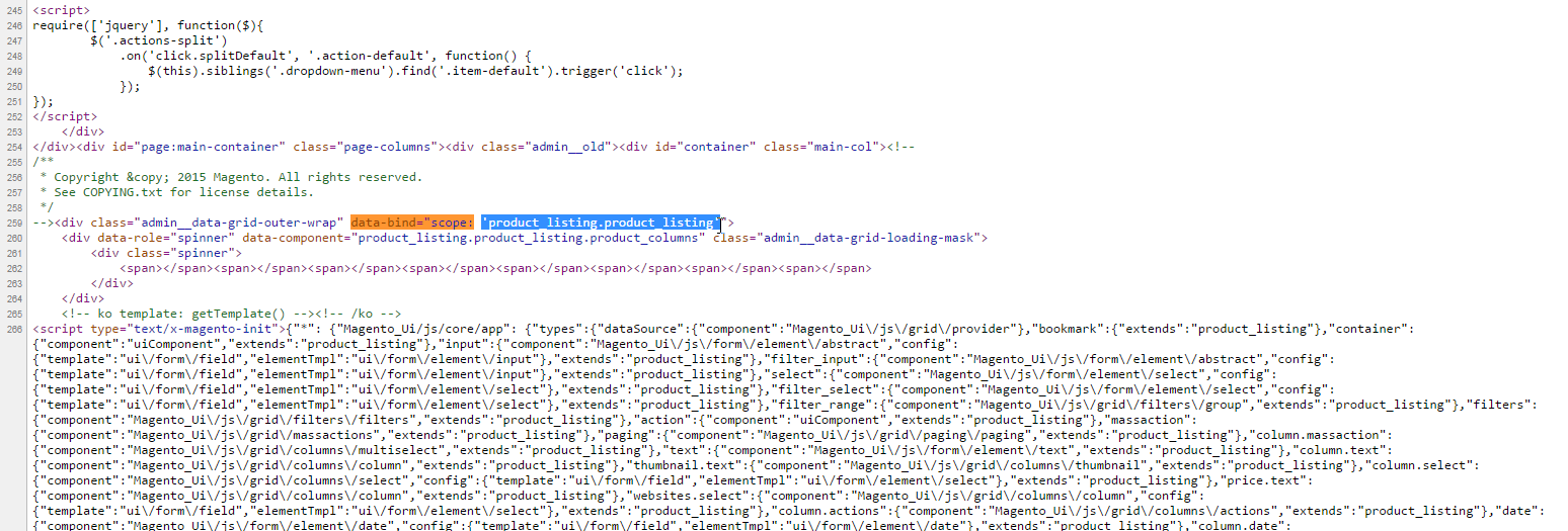
According to the described procedure, open the page source and search for Б─°data-bind="scope:Б─²

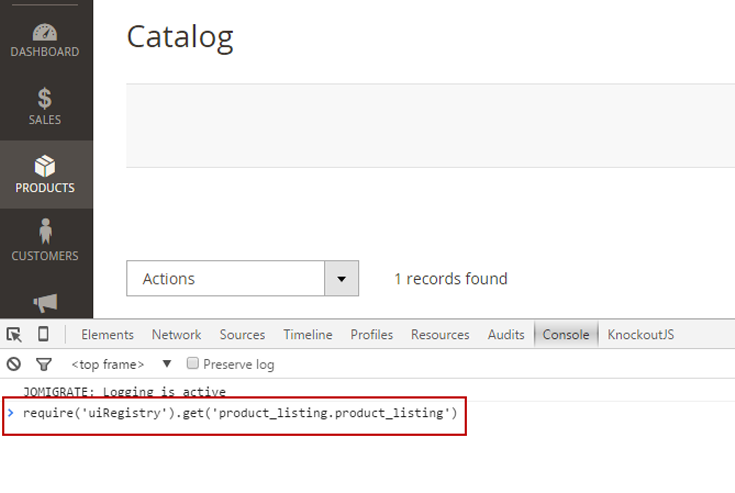
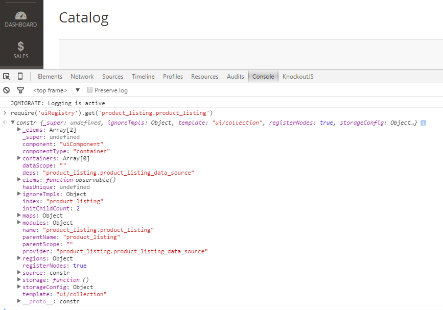
So we find out that the main UI component used on this page is product listing, with product_listing.product_listing as a full name. To see its configuration, child components and data source, in the in the Console tab we run require('uiRegistry').get('product_listing.product_listing'):

And we get the componentБ─≥s configuration:

Debug using a Google Chrome plug-in
- Install the Knockout JS context debugger for Google Chrome.
- Open the required page in Chrome.
- Point to the required element on the page, right-click and select Inspect Element. The developer tools panel opens.
- In the right column of the panel, click the Knockout context tab. The tab displays the name and the configuration of the UI component instance.
Find us on