Static Content Container
Contents
Overview
Within the Magento application, it is often necessary to display static information to the users. These static content are considered Content Container and should follow the guideline in this article.
For solutions not described in this article or for further information, please contact the Magento UX Design Team.
When to Use
- Use this pattern when we need to display static information to the users.
When Not to Use
- Do not use this pattern if users need to be able to interact with the information.
Rule
The basic rule is that the content containers should have a title and a content below it. Refer to variations for the styling examples.
Variations
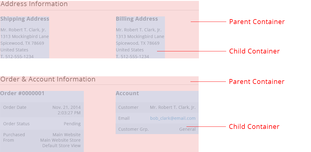
1. Parent and Child Containers
The following example, shows two sets of parent & child containers. Each parent containers has 2 children containers. There can be 1 or more children.
It is not recommended to have more than one layer of parent-child (i.e. grand children are not recommended) But if there are exceptions made, the hierarchy should be shown clearly.
Structure
The parent container structure: title, rule, content.

Styling
Note that because the children containers can be any variations of other content containers, refer to other variations for styling.

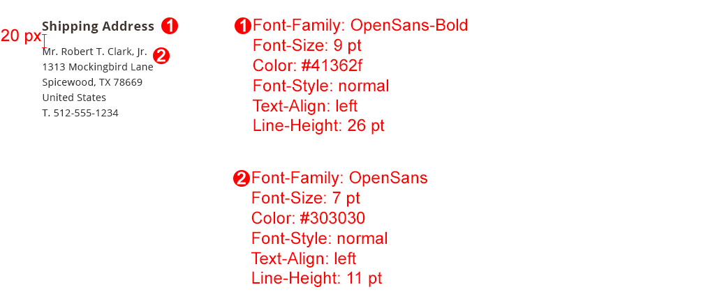
2. Title with Body of Text
Width: based on the page grid
Height: as needed

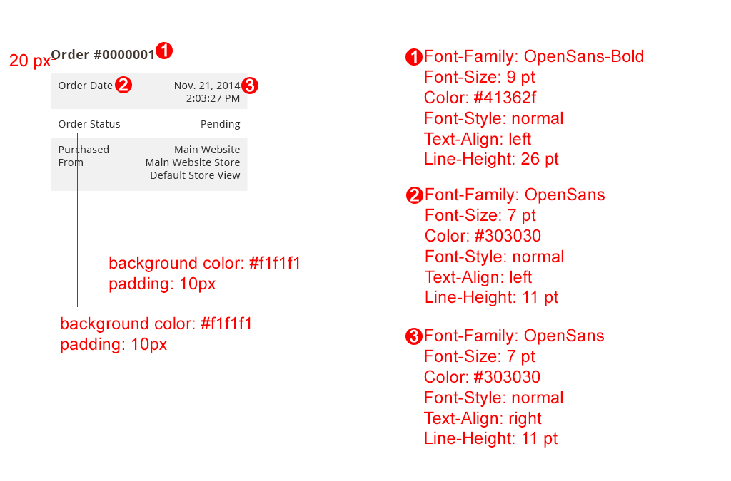
3. Title with Differentiated Rows
Width: based on the page grid
Height: as needed
This is used to clearly separate information for users to easily digest. The first row should be grey then, the rows alternate between grey and white.

4. Pricing Breakdown chart
Width: based on the page grid
Height: as needed
This is used to clearly separate information for users to easily digest.

Assets
Please reach out to the Magento UX Design team if you need anything else.
Find us on